.jpg)
Designed while Man Ray was living in Hollywood and published in December 1948, Alphabet for Adults was printed by pioneering California lithographer Lynton R. Kistler Man Ray illustrated it with reproductions of 39 fanciful cartoon drawings representing the letters of the alphabet.


Peter Saville is perhaps the most influential graphic designer of his generation. Best known for his seminal record covers for Joy Division and New Order, Saville has also art directed catalogues and advertisements for fashion brands such as Yohji Yamamoto and Dior. This book includes a comprehensive interview by Christopher Wilson as well as essays by style guru Peter York, music critics Paul Morley and Miranda Sawyer, and design critics Rick Poynor, Emily King and Peter Hall.

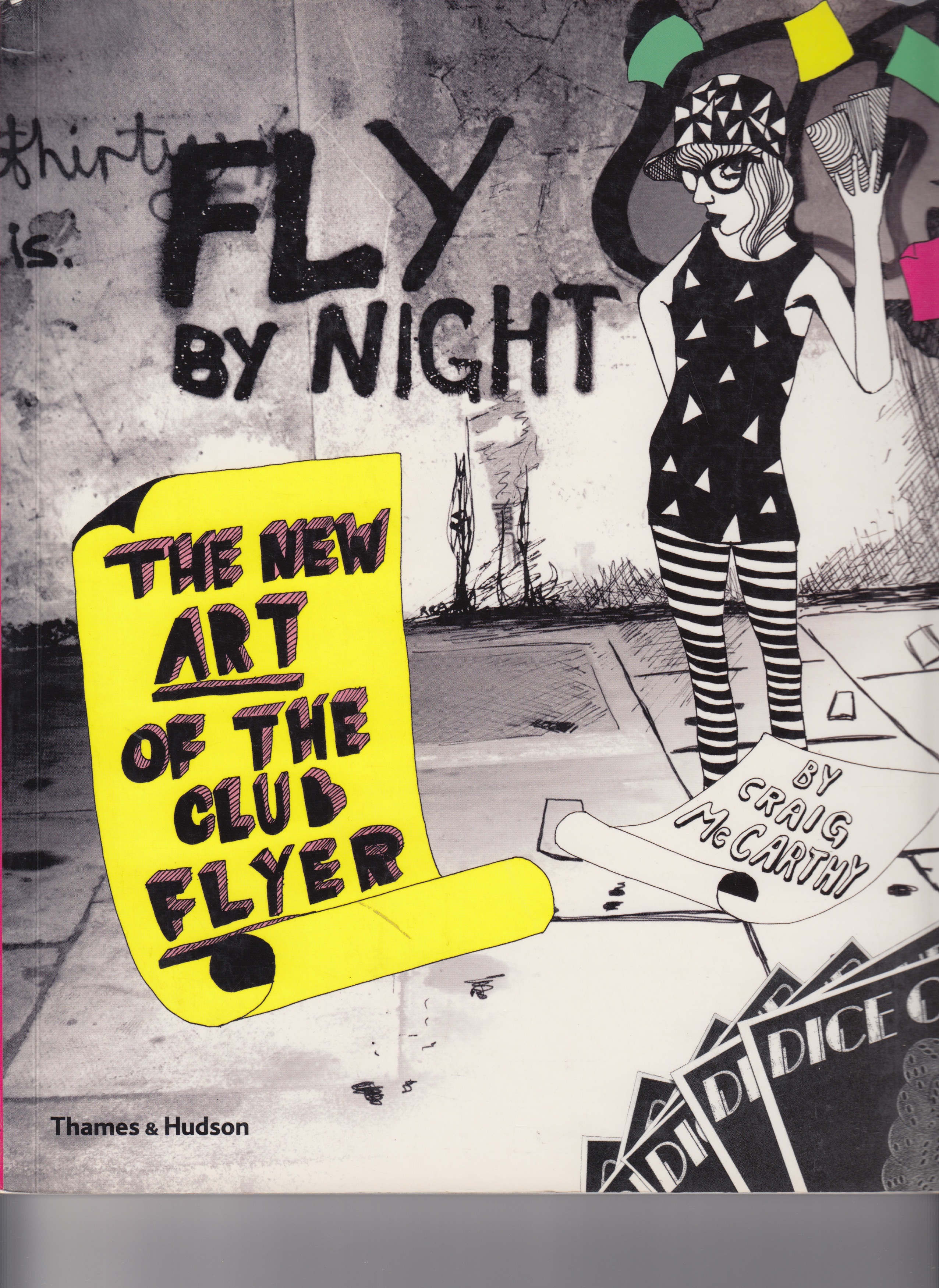
Covered with inventive, unfurling doodles, hand-drawn lettering, and image of sexy figures and party animals, the flyers reproduced here are created from drawings, tracing, photocopies, photographs, cutouts, and collages. They look back to the flyers inspired by the cut-and-paste era of the late 1980s but are given inspirational new form in the current scene.

Gay Areas Telephone Directory is an artefact from another age. It is an exact facsimile of an American telephone directory published by Gay International Inc targeted at queer population. The phonebook is a now-obsolete format, but before mobile phones and the internet every household had one by the landline. This queer directory featured listings and advertisements for businesses friendly towards or catering to lesbians and gay men at a time when such visibility was a rare and possibly dangerous thing.

Traces the development of modern graphic design, and shares the comments of top American designers

This book is artist's book by American sound artist and visual artist Terry Fox documenting 52, out of a potentially larger set, of the symbolic, often chalked, messages used by transient individuals in America and Europe.
Drawings by Hockney and essays by twenty-seven distinguished writers--among them, Oates, Murdoch, Theroux, Vidal, Mailer, Sontag, and Miller.

This manual offers an in-depth look at the further evolution of IBM’s house style in the 1970s and ’80s, from logotypes, fonts, numerals, and type specimens, to highly detailed information on imprinting binders, signage, packaging, and related material.
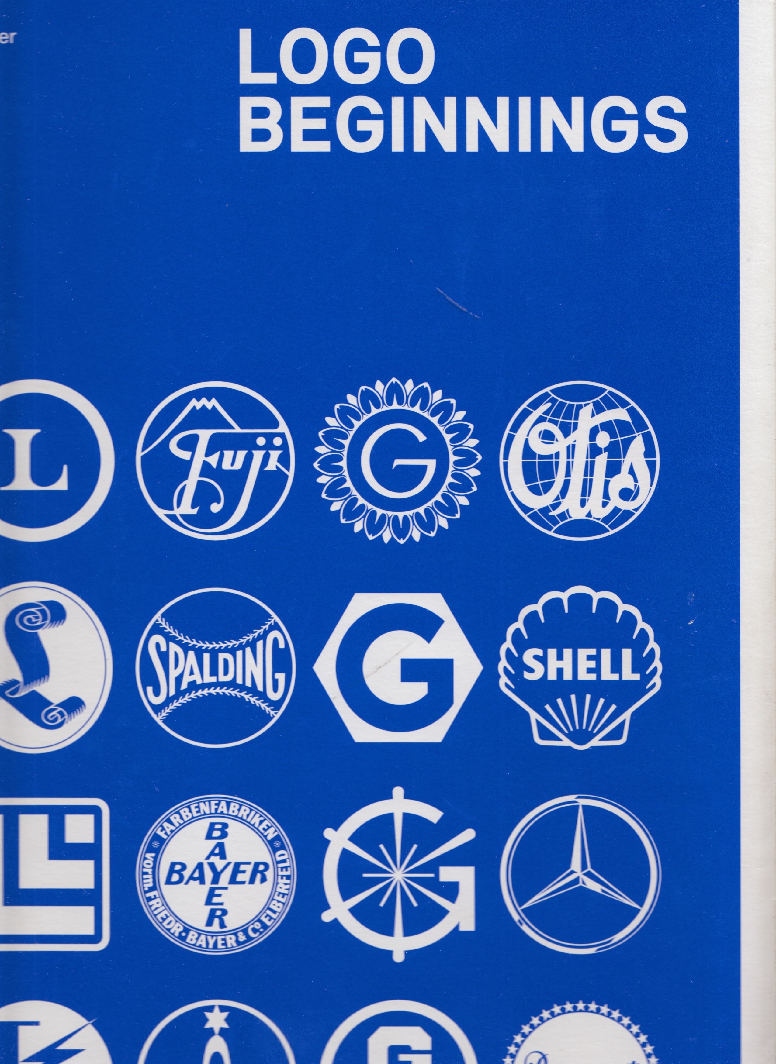
This unparalleled collection traces the development of modern trademarks and sheds light on forgotten designs and early versions of famous logos.

Making & Being draws upon the lived experience of Susan Jahoda and Caroline Woolard, visual arts educators who have developed a framework for teaching art with the collective BFAMFAPhD that emphasizes contemplation, collaboration, and political economy.


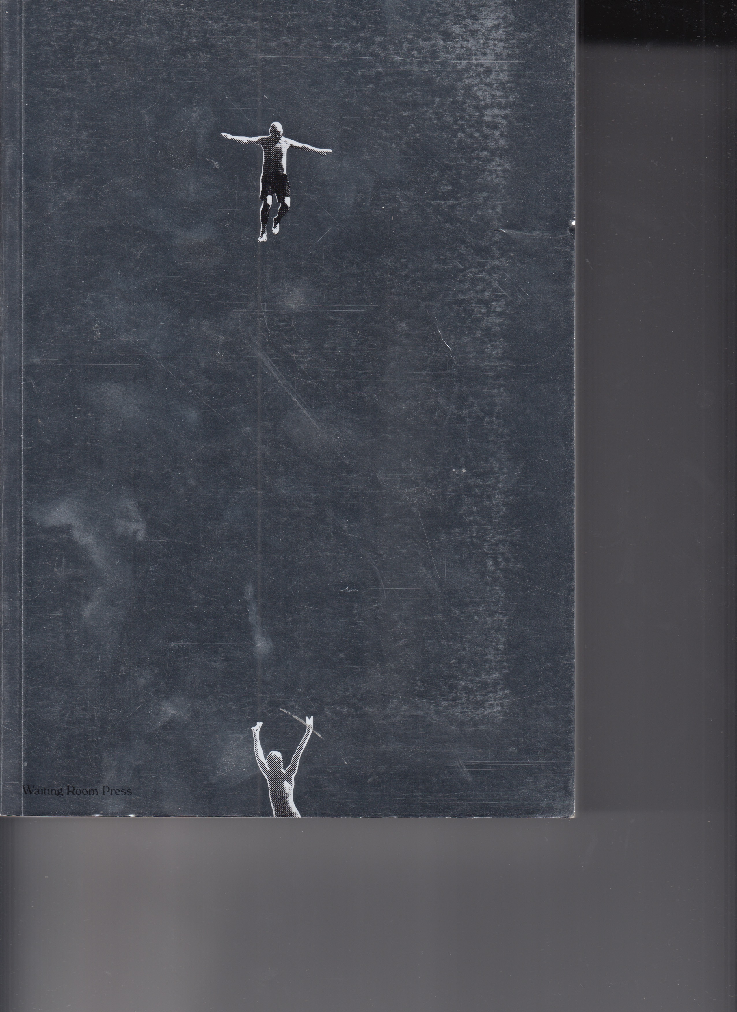
Not Dead Or Famous Enough Yet is a 600-page book that celebrates 10 years of a studio built independently from the ground up by two friends following their own path.

This book showing the nuances that defined Minimalism in its various phases, as characterized by the inflected object, the disintegrated object, the ironic object then the transition from the object to architecture, space, landscape, cityscape, body, performance, and conceptual art.
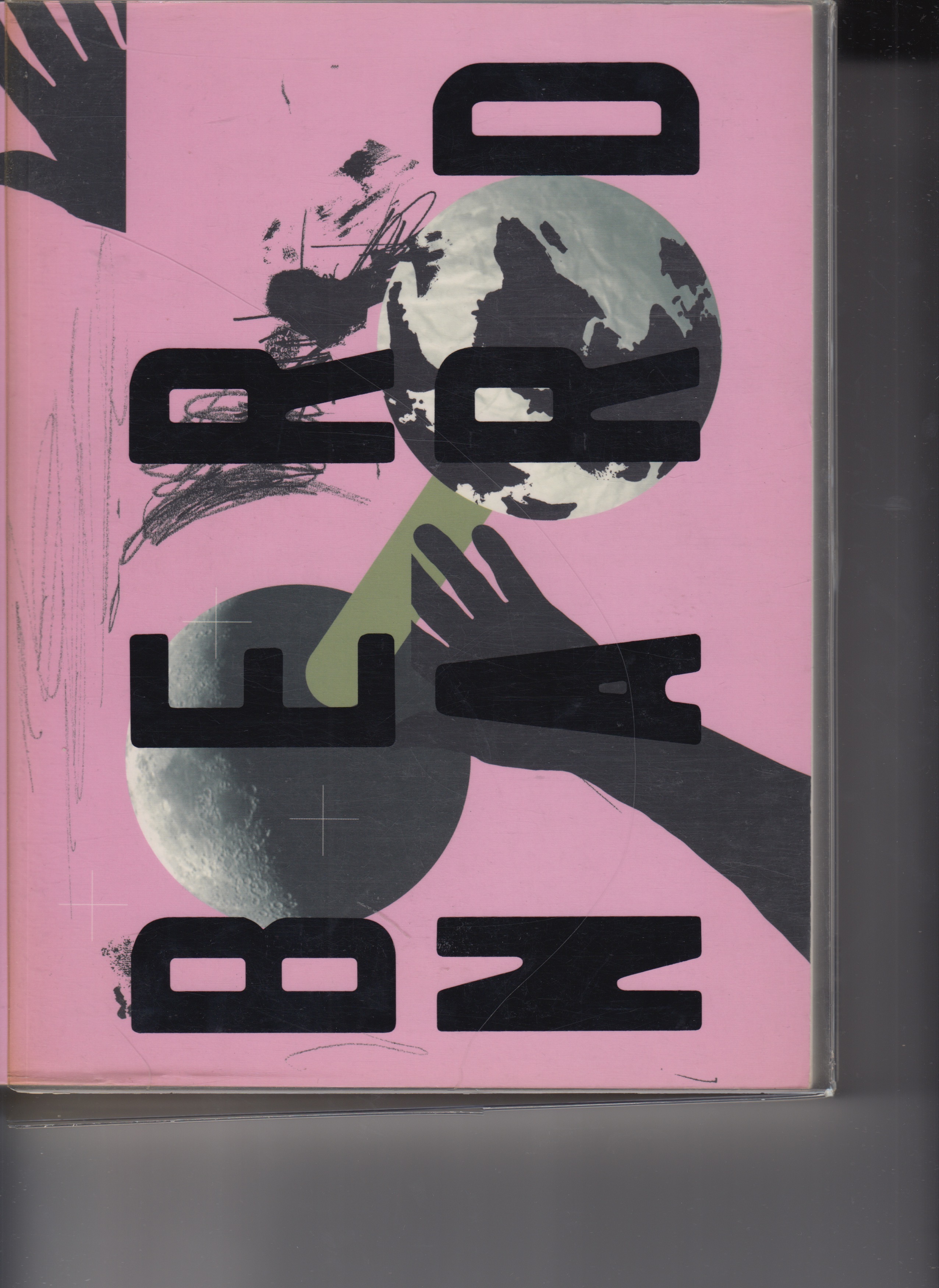
This book is part of a four part series exploring the work of four influential designers. This volume explores the work of Pierre Bernard, an influential French graphic designer known for his social, political, and cultural design work, most notably as a founder of the collective Grapus
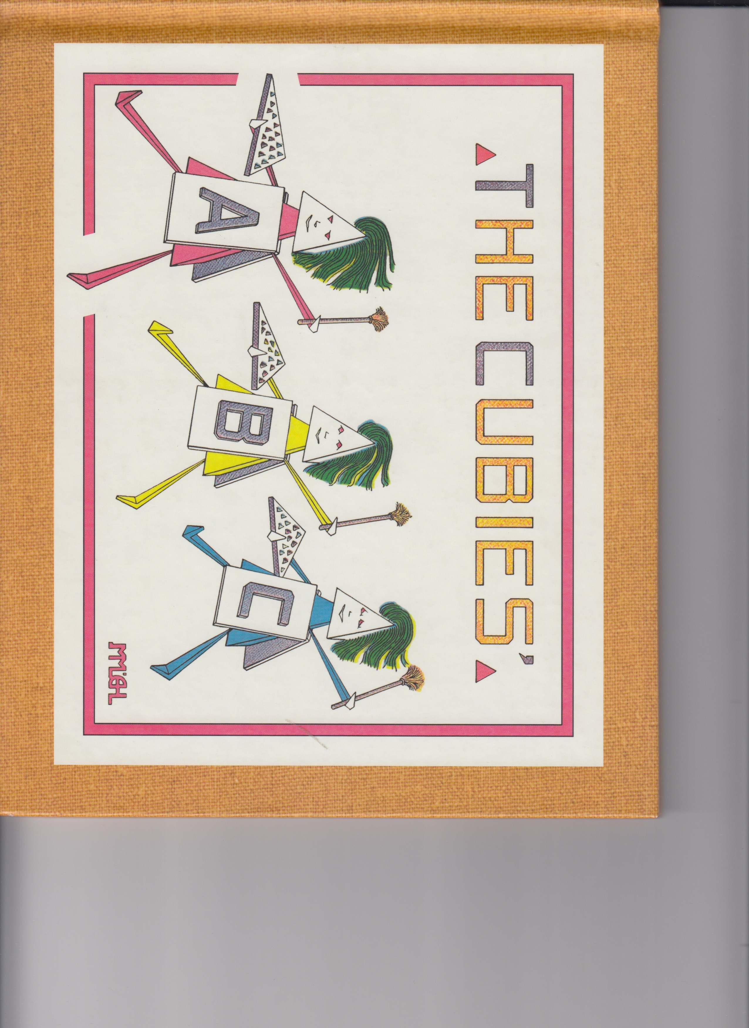
A children's book parody of the landmark 1913 Armory Show that first introduced many Americans to the conceptual artwork of Picasso, Duchamp, Matisse told through the alphabet.
.jpg)
Universally acclaimed as the world's greatest mime, Marcel Marceau takes us on a visual journey through the alphabet.


.jpg)
Los Angeles-based artist Ed Ruscha, one of the seminal American artists of the past 30 years, is known for taking elements from the visual language of advertising and commercial art: he has made hundreds of 'word' prints, drawings and paintings that exhibit an interplay between bold letters and softly shaded, atmospheric backgrounds.
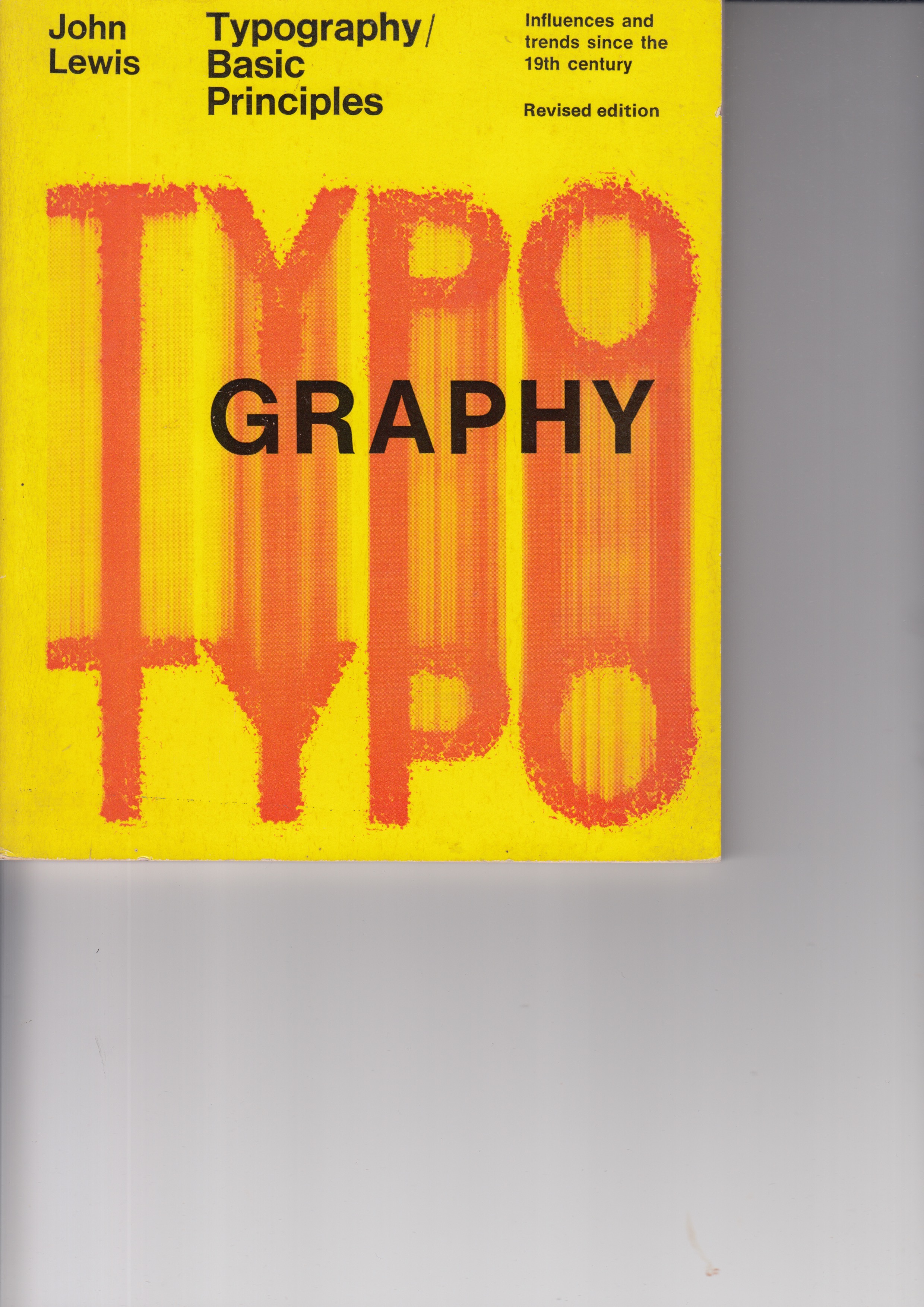
This typography book examined modern graphic design influences, from William Morris and Bauhaus to Dada and De Stijl, with trends, layout methods and more.
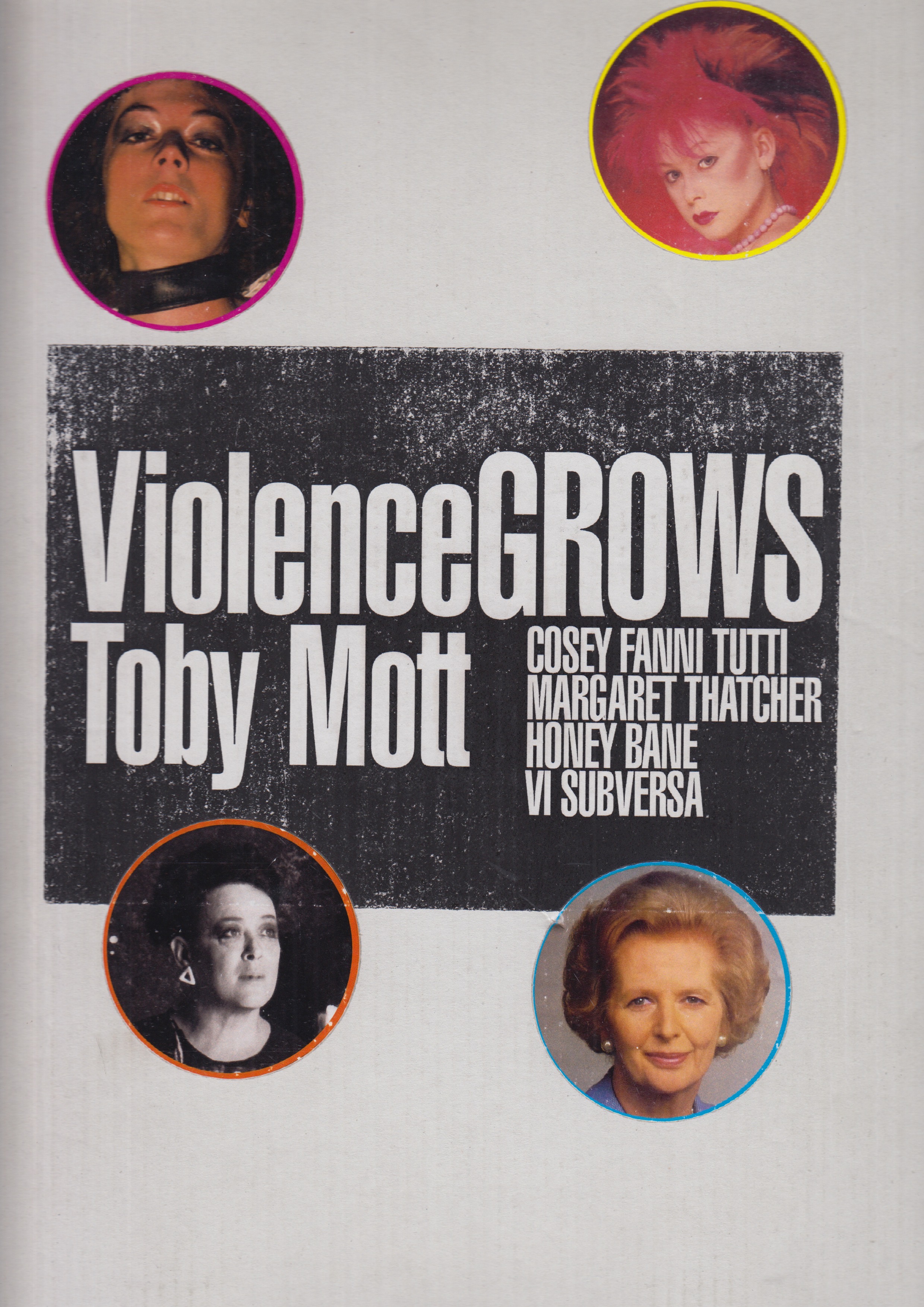
Violence Grows is a forceful, wide-ranging look at four iconoclastic female icons of the 1980s. A four-phase journey, focusing on three punk artists and one divisive politician. All four re-shaped antiquated ideas on identity, sexuality, and the role of women in a dysfunctional society. These four determined women set out to overturn the world they lived in.